

How Can We Help?
Analytics – All You Need to Know
The upgraded analytics tool has arrived. Take a look and keep this article handy if you have any questions!
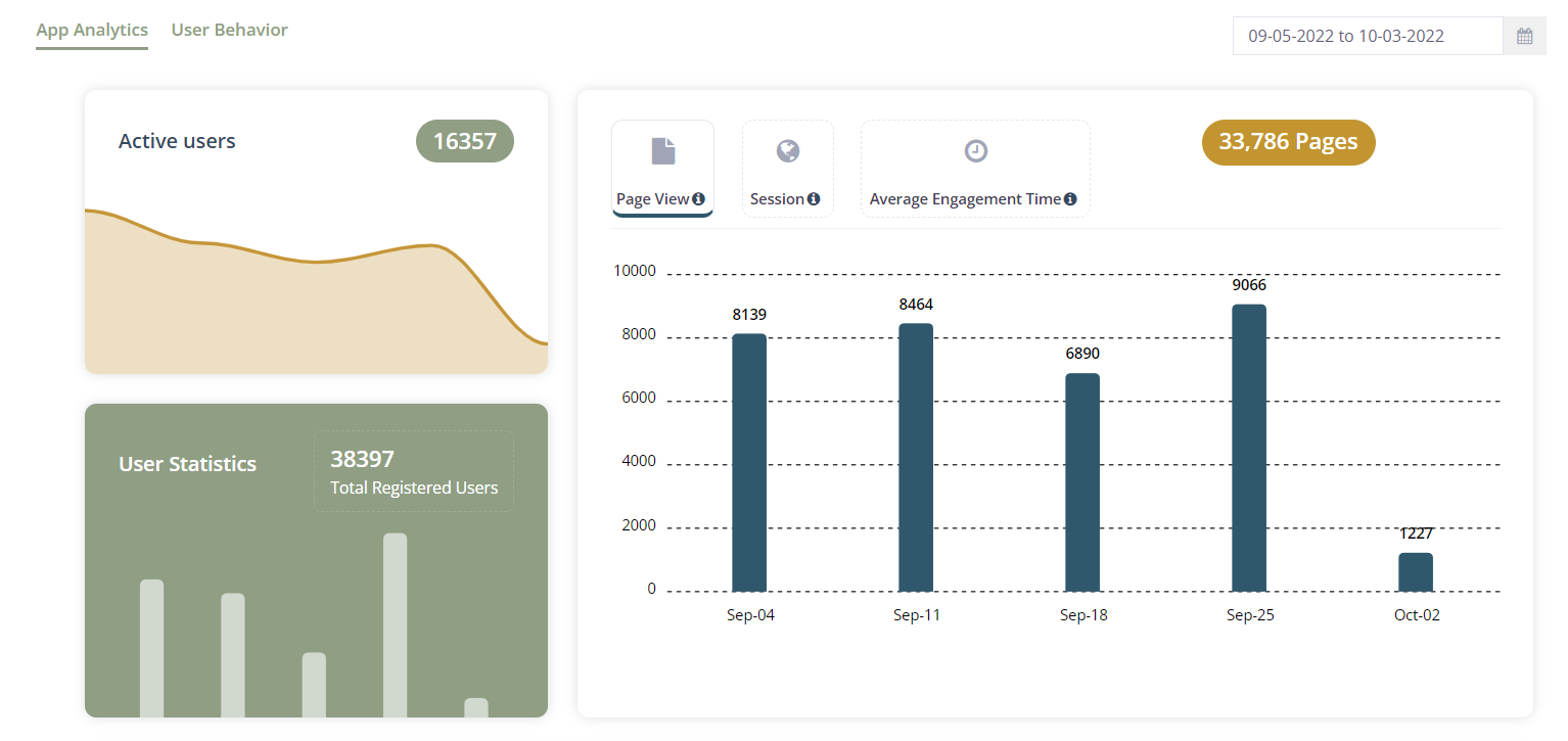
Below is a sample view of the new analytics page.
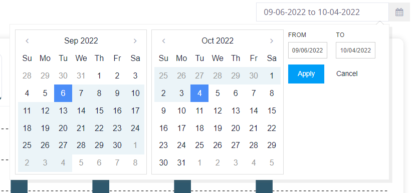
The Date Picker is in the top right corner. It defaults to a month, but you can easily change the date range. Click “Apply” to change the date.
Important notes:
- Almost each tile has data that displays when you hover on the timeline (sample below for Active Users)
- Depending on how many users that you have, it might take slightly longer for the map to load if you change the date range. Please be patient.
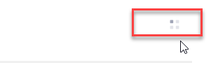
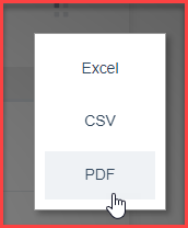
- Several tiles have a small grid icon in the top right corner – this is where you can run reports as PDF, Excel or CSV (seen below)
Active Users
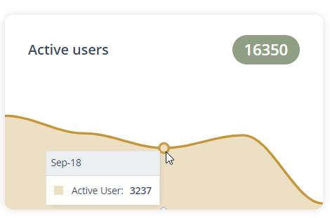
Hover your mouse (curser) on the line to see the total active users for the dates selected weekly or monthly. (in the top right corner). The large number in the top right over the “Active User” tile shows the total active users for the date range selected.
User Statistics
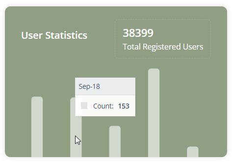
User statistics is a new feature that allows you to see how many users have registered. If you hover your mouse on the data in the chart, you can see how many users registered weekly or monthly (depending on the dates that you select in the top right corner).
Page Statistics
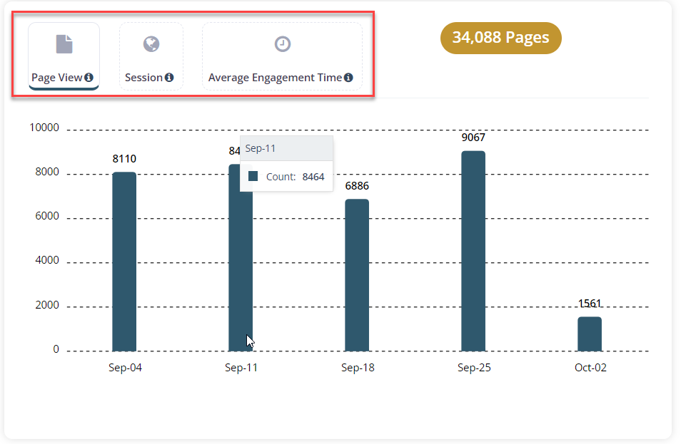
This particular tile has 3 components that you can select to view data: Page view, Sessions and Average Engagement time. Hover over the i icon next to each tile to see a description of each:
- Page View: The total number of pages viewed. A page view is an instance of a page being loaded (or re-loaded) in an app.
- Session: The period of time a user is active in your app. By default, if a user is inactive for 30 minutes or more, any future activity is attributed to a new session.
- Average Engagement Time: The user’s engagement metric shows your app’s screen time in the foreground. This metric can help understand the user’s use of your app. This metric is measured in seconds.
Downloads, Removals and Updates
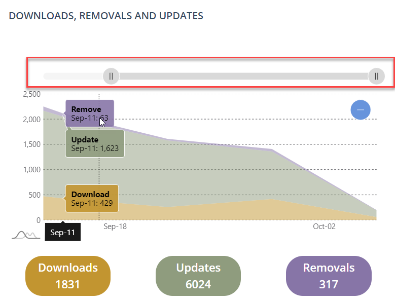
As with all other tiles, this data is defaulted to show the last month. You can change the date range by changing the date in the top right corner of the page. Hover over the graph to see details (weekly or monthly depending on the date range that you have selected). You can slide to the left or right by using the tool above the graph (seen in red above).
Locations
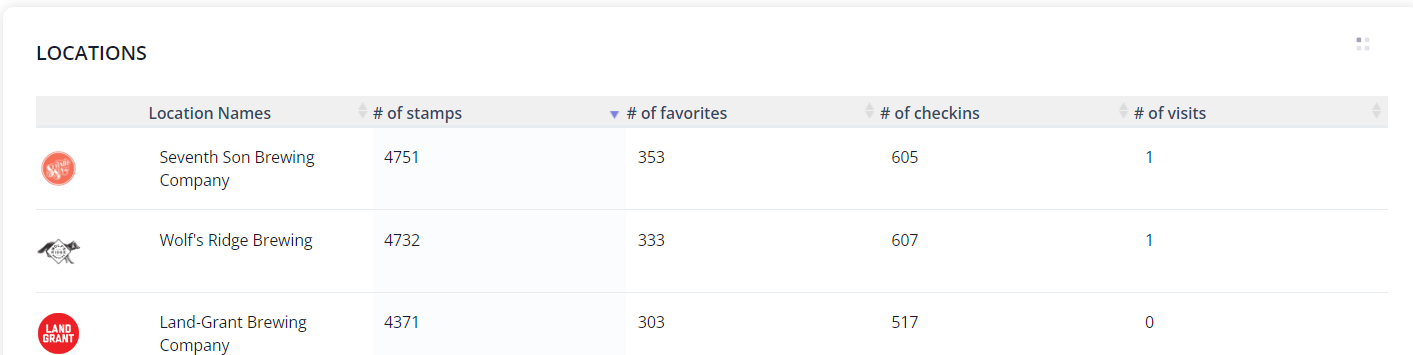
The Locations Tile is the most requested tile to date! This section shows the location names, number of stamps, Number of times that an app user has “favorited” the location, number of checking and number of page visits. Pull reports by clicking on the grid in the top right corner.
New! Events
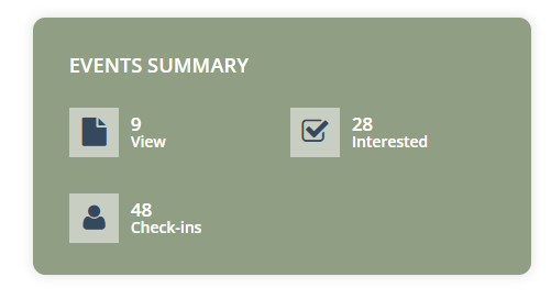
The Events tile gives insight as to how many app users are interested in your events. This data will change depending on the date that you select in the top right corner (if left as-is, it is displaying the last month)
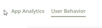
To see “User Behavior” analytics, click “User Behavior” on top left of the page.
To date, these analytics have not changed as far as data goes. They have just been simplified with the new layout.
- Passport leaderboard (Locations – top 10)
- Passport leaderboard (Users – top 10)
- Check-Ins (top 10)
- Favorites (Top 10)
- Latest Activity Feed